Precipitation stripes
Visualizing precipitation trends in the Mohawk Watershed
Annual precipitation has increased in the Watershed and elsewhere in the Northeast [1]. A recent analysis of basin wide precipitation reveals a significant increase in warm-month precipitation across the entire watershed, with the most pronounced changes occurring in Catskill-draining tributaries [2,3,4]. The change in winter precipitation in the lower part of the Watershed appears to be less significant, but there are complexities in the upper part of the basin associated with lake-effect snowfall [A3]. The increased annual precipitation has led to greater discharge in streams and rivers throughout the Mohawk Watershed, particularly during the summer and fall months. This shift in warm-month precipitation has important implications for water quality, ecosystem health, drinking water resources, sediment mobility, and hydropower. The observed precipitation trends diverge slightly from the central findings of Fifth National Climate assessment (NCA5) and other analyses [A5, A6], which highlight the importance of local analyses for planners aiming to enhance resilience and sustain ecosystem services in a changing climate. Understanding how this precipitation is distributed throughout the year is critical to building climate resilience into our water infrastructure.
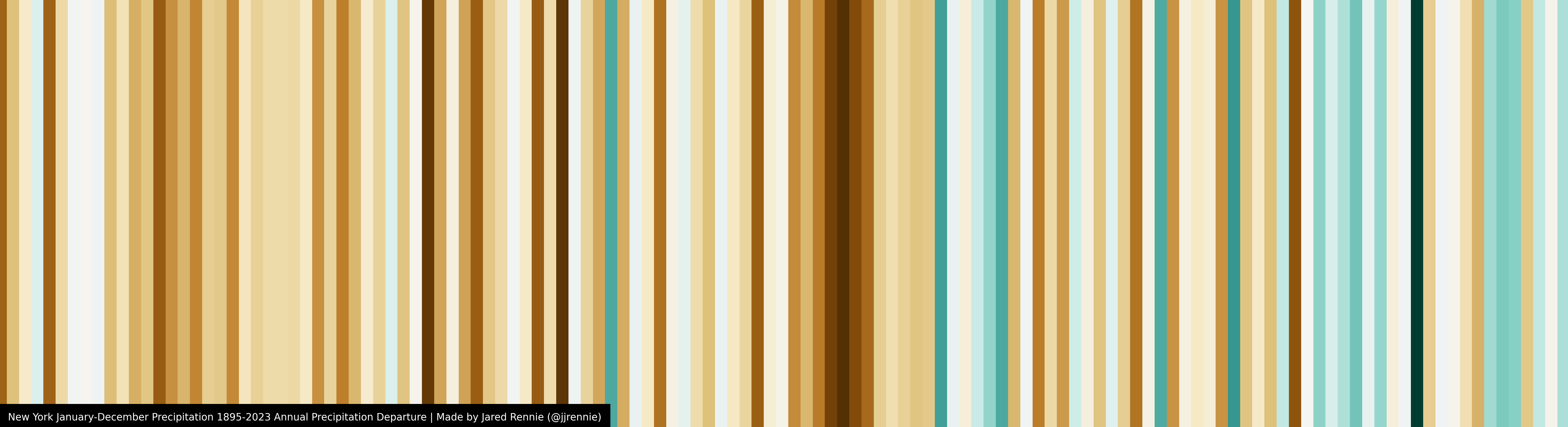
Visualization is one of the challenges of climate data when the goal is to represent change that is ongoing and may be subtle from year to year. In 2018 Ed Hawkins, climate scientist at the National Centre for Atmospheric Science, University of Reading in the UK, created a visualization technique that has come to be known as “Climate stripes”, which typically show the change in temperature over time [7]. Analyses for temperature show negative anomalies in blue (cold) and positive anomalies in red (warm). Ed Hawkin’s Substack newsletter is here. This technique can be calculated and displayed for almost anywhere on the planet, and the interactive piece “Climate stripes graphics show US trends by state and county” by Rebecca Lindsay is particularly helpful (here) [8]. This approach to data visualization has been expanded to display precipitation trends, and other climate indicators. The precipitation stripes for the interval between 1895 and 2023 for all of New York can be made here, but this display merges many data sets with different influences on precipitation trends [9].
Recall that an anomaly is a value that is above or below what is predicted. In this case if we average all annual temperature values or precipitation values, there should be scatter above or below the average (mean), and if there is no systematic change over time it has stationarity (or it is “stationary”). This is not what we see with both temperature and precipitation in the Mohawk Watershed because both are increasing, and the timing and magnitude of that change is what we are interested in exploring.
A problem with combining data across the entire state is that we miss regional differences that may be driven by Atlantic moisture, or moisture from the Great Lakes, and these can be critically important. The recent NY Climate Report notes that the wettest areas in NY state are those downwind from Lake Erie and Lake Ontario, and those that are near the Atlantic coast, including the Catskills [6]. The Mohawk Watershed drains part of the Tug Hill plateau downwind from Lake Ontario (i.e. West Canada Creek) and also drains part of the Catskill Mountains (i.e., Schoharie Creek), and thus it has a mixed precipitation regime that reflects those different sources and how those sources may be changing in a warming world [4]. The recent NY Climate Report suggests that Atlantic moisture will drive the largest increase in precipitation in the future: “The largest percentage increases in annual precipitation are projected for the New York City, Catskills, and South Hudson assessment regions” [6]. This undoubtedly means that the Catskill-draining Schoharie Creek, which is the largest tributary to the Mohawk, will continue to see a remarkable increase in discharge [2]. It has already been breaking records.
This note is focussed on several plots that show calculated precipitation stripes for the lower part of the Mohawk Watershed, and they are intended to provide an alternate way of visualizing data that is more fully covered in a recent post entitled “Increased summer rainfall in the Mohawk watershed: Water quality, flooding, and ecosystems are affected by more warm-month rain in the Mohawk watershed” [4] (here).
To do this we use monthly precipitation data from the National Weather Service collected at Albany (here) - the longest and most complete precipitation record in the Watershed [10]. The data from Albany extend well back into the nineteenth century, but here we are particularly interested in exploring the change that has occurred since the beginning of the twentieth century because this marks the beginning of the major build out of our water infrastructure in the watershed (NYC drinking water dams, canals in the Mohawk, hydroelectric schemes, and other municipal drinking water reservoirs) [11]. Let’s start with annual precipitation.
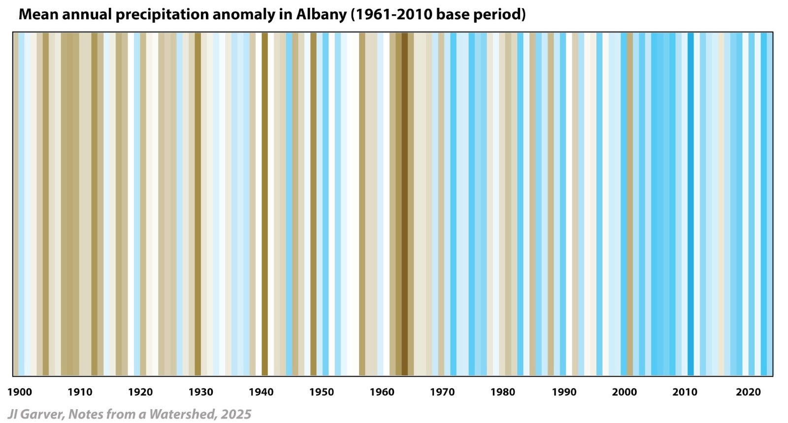
Total annual precipitation. This annual precipitation diagram (above) represents total precipitation for all years from 1900 to 2024, showing anomalies relative to the mean precipitation for the period 1961 to 2010, which was 37.7”. Values below the mean are depicted in shades of brown (below the average baseline, or dry), while values above the mean are shown in shades of blue (above the baseline, or wet). The most anomalous dry year was 1964 (-16.2”) and the most anomalous wet year was 2011 (+15.9”). The diagram visually highlights the increase in average annual precipitation observed in the lower Mohawk Watershed over the past several decades. It is complete through December 2024.
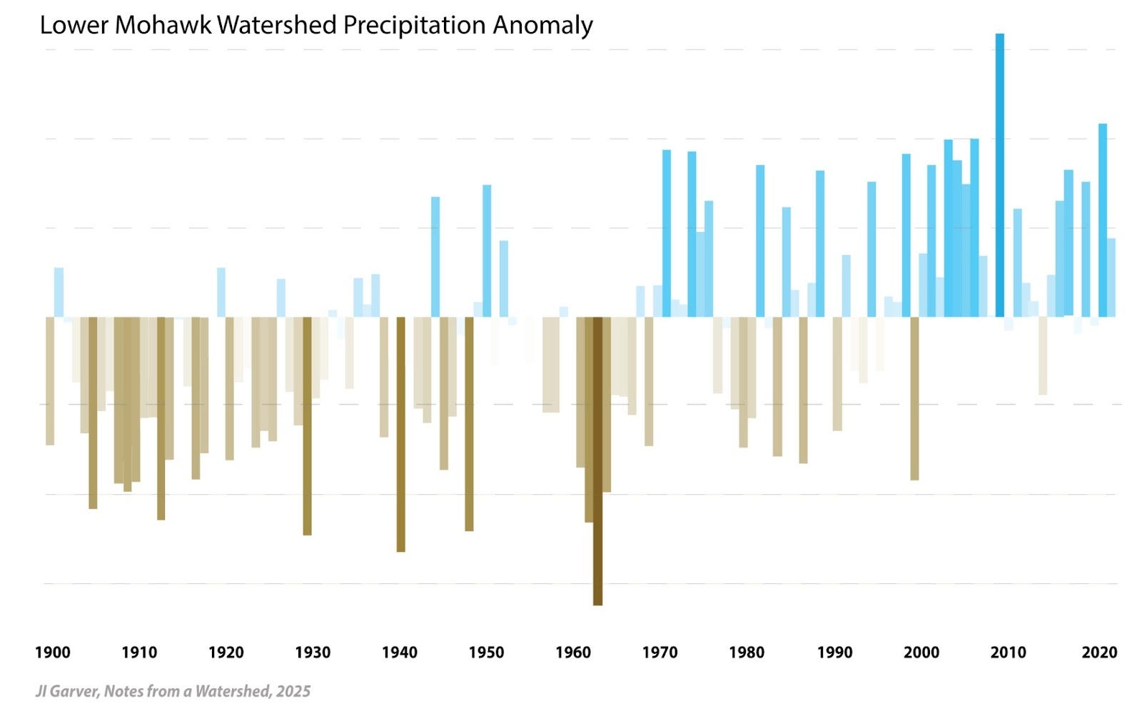
Another way to visualize the same data set is to plot the value of the anomaly over time using the same shading scheme (above). As above the baseline for this plot is 1961-2010, and on this plot the light dashed lines are 5” increments. The annual trend indicates an increase in mean annual precipitation, and a critical point to consider is how that precipitation is spread across the calendar year. A significant portion of that increase falls as rain in the summer and fall, which challenges infrastructure.
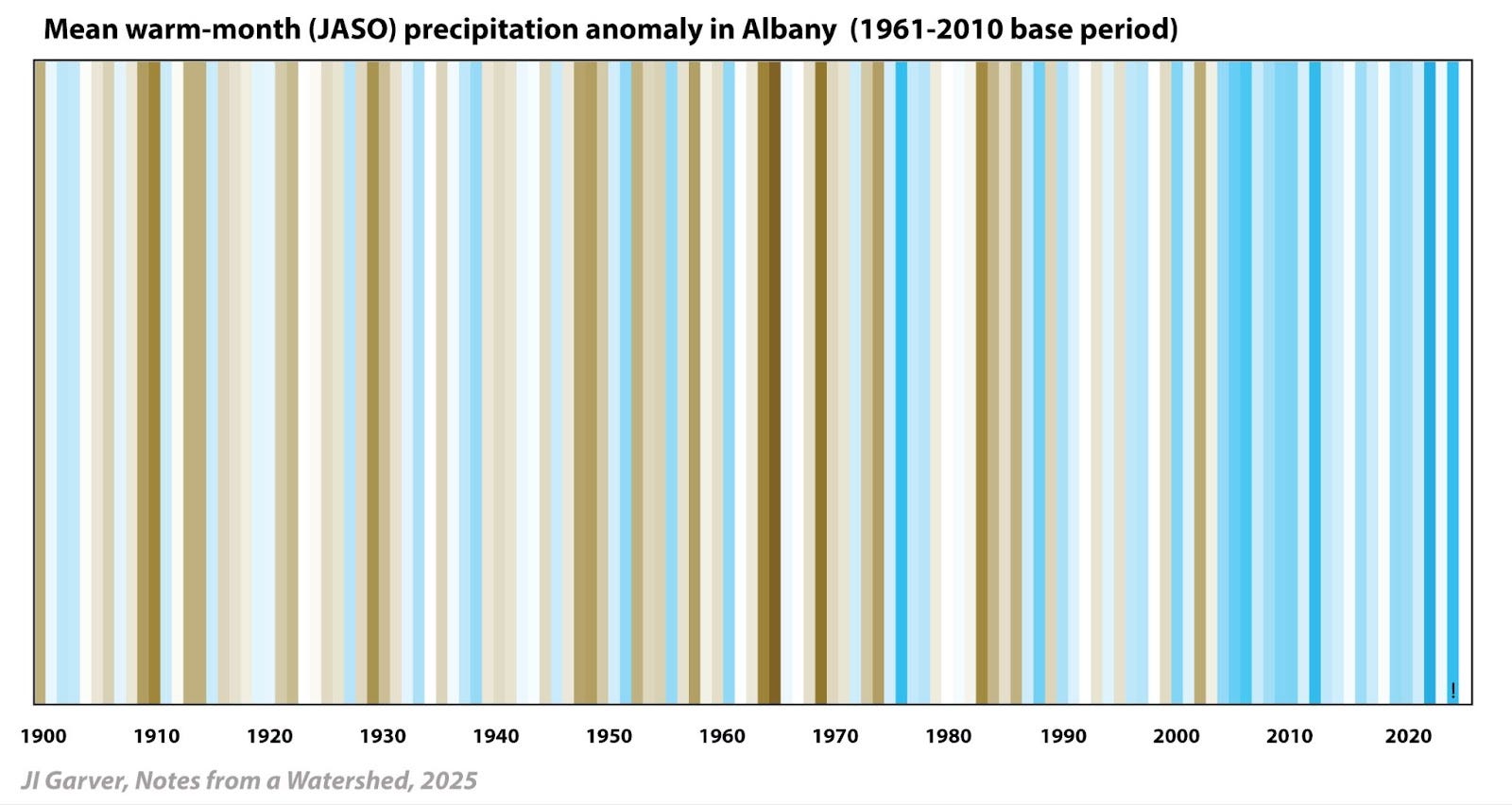
Warm-month precipitation. The warm-month plot highlights precipitation in July, August, September, and October (JASO). This is not to imply that June is not warm, but June is on the shoulder of this trend, and the most significant changes in precipitation and discharge are observed in JASO [4]. For JASO, the driest year compared to the baseline was 1964 (-8.9”) and the wettest was 2021 (+11.7”). Analyses of precipitation and discharge records across the basin, particularly in tributaries draining the Catskills and Adirondacks (see 3), confirm that the primary increase in precipitation occurs during these months, with the trend extending into the fall. Now let’s turn to the winter.
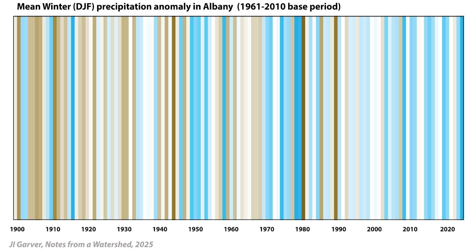
The winter plot (above) focuses on precipitation (liquid equivalent) for December, January, and February (DJF). While there is little doubt that winters are warming, the data suggest that any increase in winter precipitation is relatively modest and there is considerable variation in this data set [3]. Note that this is liquid equivalent, so there is no differentiation here for snow v. rain. For DJF, the driest winter was 1980 (-5.4”) and the wettest was 1978 (+3.8 in), which includes the blizzard of 1978 (6-7 Feb 1978) [12] (here). The mean for the baseline period (1961-2010) is 7.65 inches. It is not a surprise that complications arise when trying to project this into the next few decades [6].
Let’s auger in even farther and look at monthly data. As with most time-series analyses, a more narrow focus leads to seeing more noise or natural variability. Nonetheless, this approach has some practical applications.
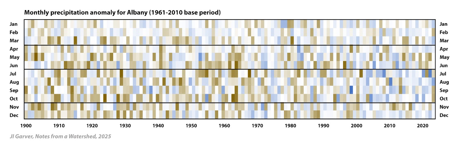
We do this by constructing a table of all monthly precipitation values, and then calculate the monthly average for the base period (again 1961-2010) [8 for procedure]. With that average, the monthly anomaly can then be determined for each month of the 124 yr grid (above). As before, brown are negative anomalies (dry) and blue are positive anomalies (wet). The largest negative anomaly was July 1968 (-3.22”), and the largest positive anomaly was September 1999 (+7.9”), which was a monthly total of 11.06” that was mostly related to Hurricane Floyd (Hurricane Irene rainfall in Aug 2011 is in second place).
Trends in anomalies can be useful in evaluating scientific data, so let’s look at one last item. What are the implications for having month after month with positive rainfall anomalies? Groundwater levels rise and surface water suffers.
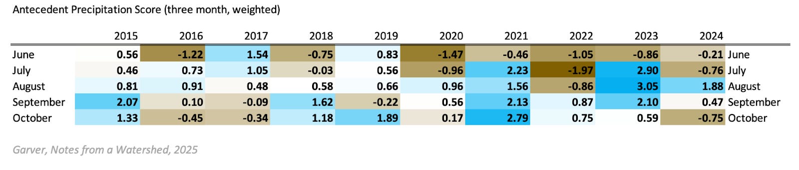
This more granular view of these precipitation anomalies may be used to better understand scientific observations and measurements related to groundwater-surface water interactions, pollution from leaky sewer infrastructure, and ecologic stress in aquatic systems. Here each month has a calculated ‘anomaly score’ that reflects the anomaly of that month, and also the previous two months (weighted x3,x2,x1, respectively). The table above is an example showing the weighted trend in precipitation anomalies for the two months prior [13]. Look at the strength of the positive anomaly trend in 2021 and 2023, which both originated from extremely high rainfall in July of that year. These were some of the wettest antecedent conditions we have seen in the watershed, and at least locally this drove very high pathogen levels and poor water quality [cf 14,15, to 16 and 17 and see 18]
This approach may be a useful metric if one is interested in groundwater-surface water interactions - important when monitoring sewage overflows from municipalities with widespread use of septic tanks [15]. If wet antecedent conditions drive high groundwater and septic overflows, we could predict that 2021 and 2023 would have been particularly problematic years, regardless of rainfall in the few days before the water quality sample was taken. Wet antecedent conditions may complicate traditional analysis that casts results in the context of recent (48 hr) precipitation only [18].
The average annual rainfall in the watershed is increasing, and our pipes and dams are aging. Climate resiliency plans must address the compounded challenges posed by these two intersecting stressors on our water infrastructure.
Further Reading and notes
[01] Picard, C.J., Winter, J.M., Cockburn, C., Hanrahan, J., Teale, N.G., Clemins, P.J. and Beckage, B., 2023. Twenty-first century increases in total and extreme precipitation across the Northeastern USA. Climatic Change, 176(6), p.72.
[02] Cockburn, J.M. and Garver, J.I., 2015. Abrupt change in runoff on the north slope of the Catskill Mountains, NY, USA: above average discharge in the last two decades. Journal of Hydrology: Regional Studies, 3, pp.199-210. (here)
[03] Plummer, I, and Garver, JI. 2023. Changes in temperature and precipitation patterns in the Mohawk Watershed: implications for flooding, water quality, and ecosystem health. In Mohawk Watershed Symposium, v. 13, p. 54-58.
[04] Garver, JI, 2023. Increased summer rainfall in the Mohawk watershed; Water quality, flooding, and ecosystems are affected by more warm-month rain in the Mohawk Watershed. Notes from a Watershed at Mohawk.substack.com
[05] Fifth National Climate assessment (Northeast). Whitehead, J.C., E.L. Mecray, E.D. Lane, L. Kerr, M.L. Finucane, D.R. Reidmiller, M.C. Bove, F.A. Montalto, S. O'Rourke, D.A. Zarrilli, P. Chigbu, C.C. Thornbrugh, E.N. Curchitser, J.G. Hunter, and K. Law, 2023: Ch. 21. Northeast. In: Fifth National Climate Assessment. Crimmins, A.R., C.W. Avery, D.R. Easterling, K.E. Kunkel, B.C. Stewart, and T.K. Maycock, Eds. U.S.Global Change Research Program, Washington, DC, USA.
[06] Lamie, C., Bader, D., Graziano, K., Horton, R., John, K., O'Hern, N., Spungin, S. and Stevens, A., 2024. New York State Climate Impacts Assessment Chapter 02: New York State's Changing Climate.
[07] Hawkins, E, 2024. Showyourstripes. University of Reading, UK Here.
[08] Lindsey, R. 2024. ‘Climate Stripes’ graphics show US trends by state and county. At Climate.gov. (here)
[09] North Carolina Institute for Climate Studies (NCICS). Data sets and images for states are here.
[10] Precipitation data were collected from either the National Weather Service, or the NOAA climate website. For average annual precipitation the data were manipulated in an Excel spreadsheet. The average annual precipitation was calculated for the baseline of 1961 to 2010. That average was used to calculate the anomaly for all years in the data set. The calculated anomaly was color coded using conditional formatting with brown for dry, white for the middle 50%, and blue for the wet anomaly. Winter year is the year of January and February.
[11] Garver, JI, 2025. Risk rising with aging dams: Climate change and dam safety will drive decisions on the fate of many NY dams, Notes from a Watershed at Mohawk.substack.com
[12] National Weather Service, ALY, 2025. “Major Winter Storms” (here).
[13] Using three month interval, and the weighting scheme are used here to illustrate the concept but have not been tested. This idea is based on qualitative observations of how groundwater wells in the Schenectady aquifer respond to significant rainfall after a dry period. For an example, see USGS SN730 in late summer 2024.
[14] Wright, J. 2022. Sewage and pathogen contamination in urban streams in the Schenectady in the lower Mohawk watershed. Department of Geosciences, BSc thesis, June 2022. 63 p.
[15] Ragland, CJ. Sewer System Infrastructure and Stressors on Water Quality in Stream within the Alplaus Watershed in Upstate NY. Environmental Science, Policy, and Engineering Program, BSc thesis, June 2022. 90 p.
[16] Goodman, J. 2023. Fecal indicators bacteria indicate impairment of surface water quality in the Indian Kill watershed in the town of Glenville. Environmental Science, Policy, and Engineering Program, BSc thesis, June 2023. 34 p.
[17] Phillips, EL., 2024. Water quality of the Kromme Kill and Collins Lake system, Scotia and Glenville New York: Impairment due to septic failure and salinization. Environmental Science, Policy, and Engineering Program, BSc thesis, June 2024. 38 p.
[18] Law, NA, Brabetz, BL, Epstein, J, Lipscomb, J., Pillitteri, S, Rodak, C, Shapley, D., Giacinto, AJ, and Restrepo, SV, 2023. Toward a more swimmable Mohawk: Trends in water quality based on an eight-year fecal indicator bacteria (FIB) monitoring partnership. In Garver, J.I., Smith, J.A., and Rodak, C. 2023. Proceedings of the 2023 Mohawk Watershed Symposium, Union College, Schenectady, NY, v.13, p. 42-27.